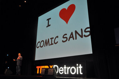
Quicken Loans CEO Dan Gilbert espoues the virtues of Comic Sans at TEDxDetroit. Photo: Jonathan Oosting, MLive.com; I think this is fair use.
This past winter, Philadelphia entrepreneur and blogger Jason Lorimer commuted back and forth between his city and Detroit a dozen times, leaving us with this list: Six Things I Love About Detroit… So Far. Up there with regular, easy-to-like stuff like “live music” and “Avalon Bakery” was an item whose recognition, I believe, is long overdue: our typography.
I don’t know what it is, exactly — maybe it’s inspired by our wealth of 1920s through 1960s architectural wonders, or perhaps the presence of one of the world’s top undergraduate schools of design has something to do with it. Or it could be just that a sprawling sea of suburban McMansions has floated all our tasteless, tacky people off to faraway places like Macomb Township and Canton. But whatever the reason, text in Detroit just looks good, and you can see it in our menus, on our signs, and in our street art.
With this kind of reputation on the line, we should be particularly alarmed that one man appears to be on a maniacal quest to remake the city in the image of Comic Sans.
Michigan native Dan Gilbert, who not only owns Detroit’s Quicken Loans and a bunch of buildings downtown but also some Ohio sports teams, drew unprecedented attention to the loved-by-a-few-hated-by-everyone-else font with what is perhaps its most prominent use to date: a 2010 open-letter rant delivered in response to the defection of former Cleveland Cavaliers star LeBron James.
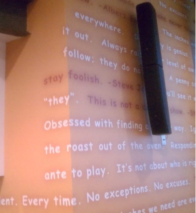
We can’t hate on the guy too much, of course. Unlike Detroit’s other billionaires (as Curbed Detroit architecture critic Kelly Ellsworth points out), Mr. Gilbert actually locates businesses in the buildings he buys, rather than turning them into parking lots or letting them sit around in a state of increasing decay. Still, it’s hard not to be somewhat alarmed positively terrified at the sight of the world’s worst-font-ever-created popping up with increased frequency downtown, in everything from the most ephemeral (ice sculptures at Cadillac Square) to the more permanent (the new M@dison Building’s interior design).
In a piece describing the “atrocious” nature of Mr. Gilbert’s taste in interior decor, Ms. Ellsworth writes: “[the M@dison Building] would be really nice if Dan Gilbert could get over his Comic Sans fetish. But what you end up with are spaces that should be (and almost are) awesome, and instead you just end up annoyed.”
Well, Ms. Ellsworth — at least he didn’t use Papyrus.


Take action: http://www.change.org/petitions/google-ban-comic-sans-from-gmail
http://achewood.com/index.php?date=07052007